Visualizing Lolita
1955 FR Olympia Press, Paris - dezimmer.net.jpg
In 1955, Russian-American author and literary critic Vladimir Nabokov published his most renowned novel: Lolita. Over the course of the next few decades the famous story about the ordinary Humbert, who falls in love with a 12-year-old girl, gained popularity, was translated in a myriad of languages and was adapted into various movies and theatre plays. As Lolita travelled across the globe and throughout different eras, the story shifted from culture to culture, and has been interpreted by many different perspectives. People have thought the story to be controversial, as it does not shy away from depicting what has been labelled as paedophilia, whilst others think that its literary form takes precedence over any sexual controversy. This is just the tip of the iceberg when it comes to different adaptations and views on this novel.
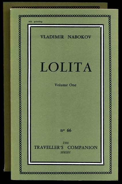
One of the many aspects of Lolita where these differences are highlighted, is the book cover. The first edition ever published had a simple, green cover with nothing but plain text: the author’s name and the title. However, many publishers from different countries and eras chose to provide Lolita with another cover. They made a deliberate decision to change the cover and had to think about what that cover should be. . The choices reveal some interesting information: what does a certain cover of Lolita say about the culture of the audience, of that time period and of that country? Why would a publisher choose a specific visual translation? Two covers of Lolita will be discussed here.